
Imagility Website Redesign
Segmenting User Journeys for Higher Conversions
Imagility is a cloud-based immigration management platform serving law firms, companies and individuals. To communicate this at every stage of the journey through a single generic experience, restricting low lead conversions and poor segmentation, we led the UX & Content Strategy for a complete website renovation — reformatting a general-purpose site into three clear, targeted experiences and reducing user drop-off.
- My Role
- UX Strategy · Information Architecture · Content Direction · Website Restructuring · UX Experience Design
- Outcome
- 3x+ improvement in conversions, clear segmentation, and improved ROI across all user groups
- Year
- 2024
"One Size Fits None"
Imagility serves three fundamentally different audiences — attorneys, companies and individuals — but before the redesign, the site forced them through the same undifferentiated pages.
Key Pain Points
- Undifferentiated content — too much information with too little clarity
- Messaging mismatch — copy spoke to no single audience clearly
- Navigation friction — it took too much digging to find relevant information
- Lead quality gaps — same generic form for every visitor type
- No traceability — marketing couldn't attribute leads by user type
Pre-Renovation Indicators

Understanding the Users
Stakeholder discussions and heuristic analysis were used to identify the unique expectations of each audience.
⚖️ Attorneys
Needs
Case management, compliance, workflow visibility
Pain Points
Too much generic copy, unclear applicability
🏢 Companies
Needs
Employer petition tracking, streamlined hiring workflows
Pain Points
Employer stories were buried under attorney-first messaging
🙋 Individuals
Needs
Guidance, transparency, step-by-step case updates
Pain Points
Difficulty understanding what applied to their own case
What Was Broken
A structured heuristic audit of the existing site surfaced five recurring issues.
- Siloed content living in a unified experience
- Hard-to-scan content hierarchy
- Generic, one-size-fits-all CTAs
- No clear primary path for any single user type
- Analytics blind spot — no visibility into which user type converted

Segmentation by Design
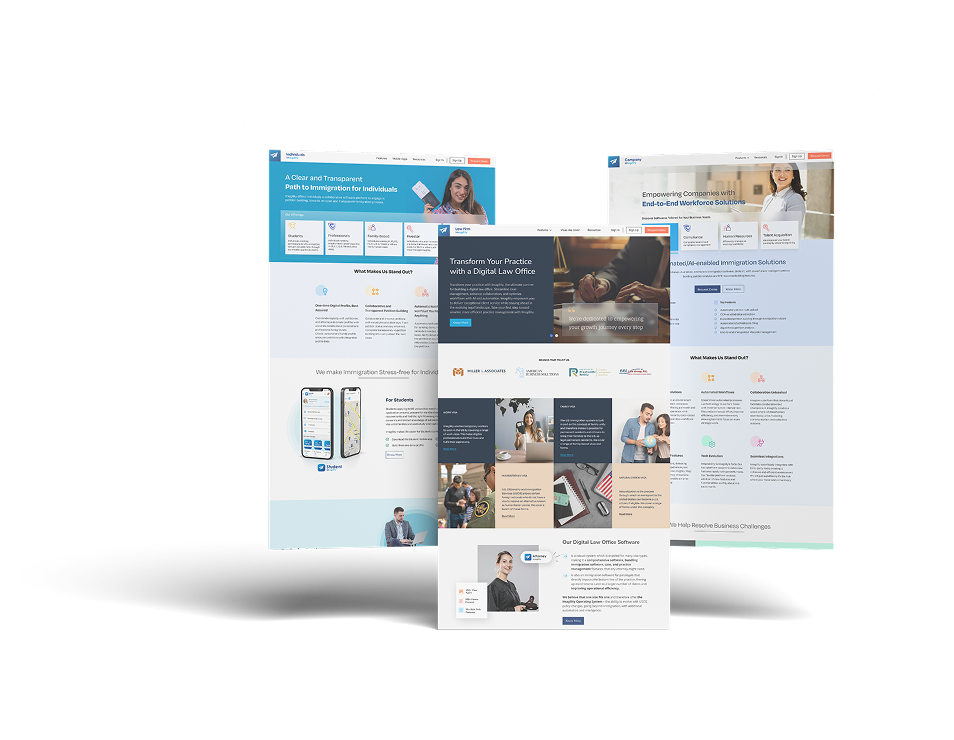
To solve "one size fits none," the site was redesigned into three fully separated experiences, each with its own navigation, content and CTAs.
⚖️ Attorneys
- Dedicated case management messaging
- Build clear conversion funnels
🏢 Companies
- Improve lead qualification
- Redesign employer-first pages
🙋 Individuals
- Applicant-supporting page copy
- Reduced cognitive load per page
Information Architecture
Three fully separated architectures — each with tailored navigation and dedicated feature explanation.
Law Firms
- Features Overview
- Case Management
- Compliance Tools
- Resources
- Request Demo
Company
- Products
- Employer Petitions
- Company Resources
- Login / Sign Up
- Request Demo
Individual
- Case Tracker
- FAQs & Guidance
- Individual Resources
- Visa & Case Status
- Get Started
Wireframing & User Journey Redesign
Wireframes were built scenario by scenario, so each user journey begins with a spot-specific value statement.
- First-click clarity — every journey begins with a spot-specific value statement
- Reduced friction — shortened pathways from landing to CTA
- Thoughtful CTA hierarchy — one supportive, one primary CTA designed for intent


Final UI — The Three Sub-Sites
Three separate experiences built from shared components, each focused on its own audience.


Quantifiable ROI — Post-Launch Impact
| Metric | Before | After | Result |
|---|---|---|---|
| Overall Conversion Rate | 1.6% | 5.2% | +166% |
| Company Leads | 68% | 82% | +140% inc. |
| Attorney Bounce Rate | 68% | 41% | -27% |
| Lead Touch Time | 48 hrs | 6 hrs | -87% |
Additional Gains
- Higher-quality leads calls per week
- Rapid content updates thanks to a modular UI
Conversion Strategy Improvements
- Role-based landing pages
- CTA hierarchy matched to intent
- Segmented onboarding flows
Strategic Wins
- Imagility now supports each audience with dedicated experiences
- Better-aligned handoff between marketing and sales
- Faster, more confident content updates
Next Steps for Imagility
- Personalized onboarding per user type
- Deeper SEO segmentation
- Continued accessibility improvements
Thank You for Viewing
Project Credits
- UX Strategy & Design Lead
- Jithesh TP
- Project Manager
- Karan Tiwari
- Engineering
- Imagility Engineering Team